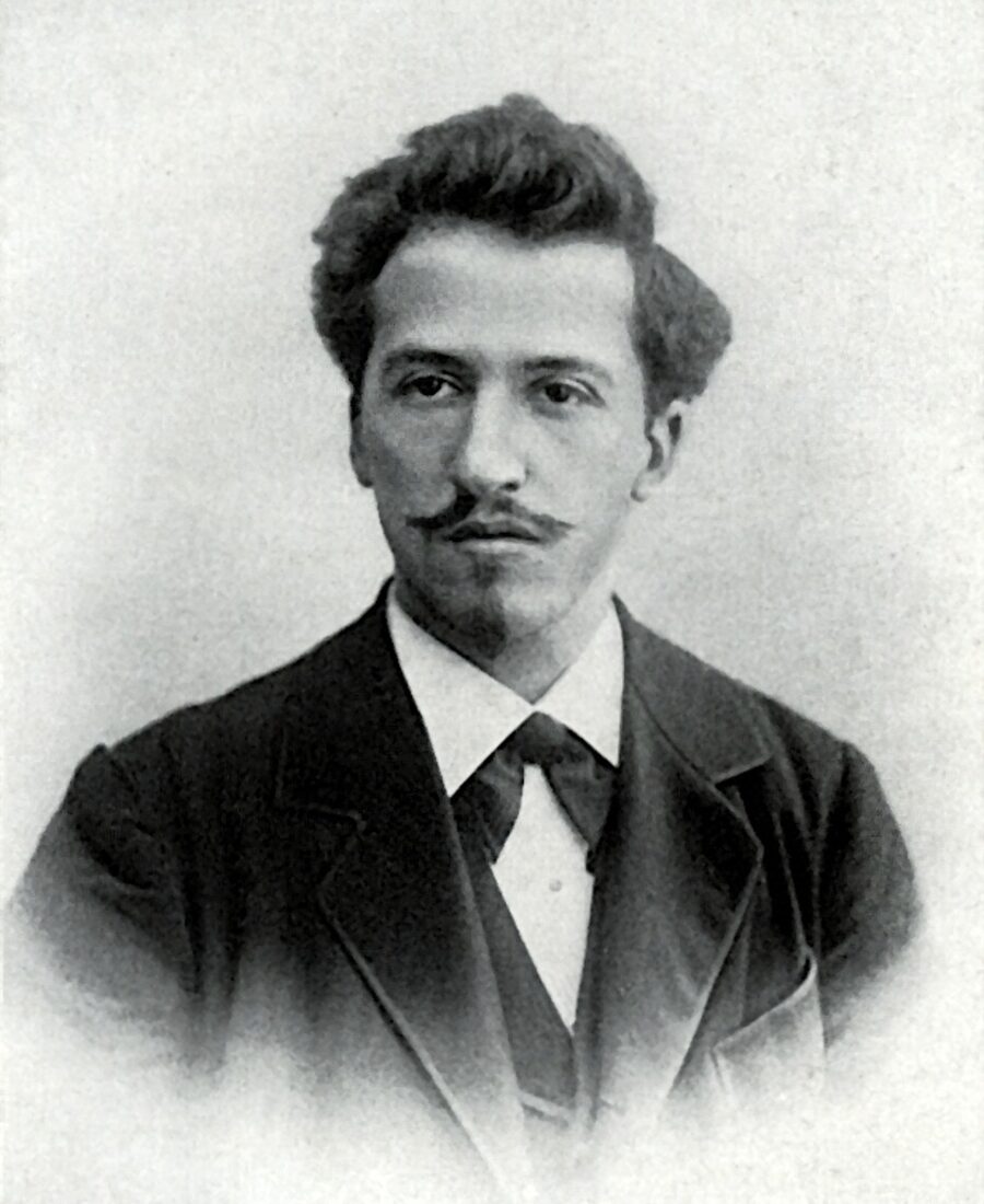
Author
Piet Mondrian
Movement / period
Avant-Garde
Medium
painting
Location
Kunsthaus Zurich, Zurich
Mondrian was a dedicated theosophist who believed the three primary colors and three non-colors (black, white, grey) represented a cosmic balance between the spiritual and material — this painting was, for him, a literal diagram of universal harmony, the same cosmic equilibrium between opposites that theosophy taught was the hidden order underlying everyday reality.

Highlights
Facts & legends
- The canvas is tiny — just 45.5 × 45.5 cm — yet it has become one of the most reproduced images in 20th-century art history, appearing on everything from IKEA posters to Yves Saint Laurent dresses.
- Mondrian was a dedicated theosophist who believed the three primary colors and three non-colors (black, white, grey) represented a cosmic balance between the spiritual and material — this painting was, for him, a literal diagram of universal harmony.
- He spent years reworking the proportions of the black grid lines, and X-ray analysis has revealed multiple earlier versions underneath the final surface, including grids with completely different proportions that he painted over.
- In 1995, an owner hung a version of this composition upside down for 77 days at New York's Museum of Modern Art before a Mondrian scholar noticed — the museum quietly corrected it without making an announcement.
- Mondrian refused to sell to buyers he suspected would resell quickly for profit; he tracked his works carefully from his Paris studio and cut off dealers who he felt were treating his paintings as commodities rather than ideas.
- The painting directly inspired the grid-based visual language of mid-century graphic design, and Mondrian's color-block logic is still taught in every major design school as the foundational example of visual rhythm through constraint.
Estimated value
What it is worth today
This Composition is at the Kunsthaus Zürich and not for sale. Mondrian grid paintings of this type have reached over $50 million at auction.
More details A tiny 45-by-45-centimetre canvas, commissioned by an architect friend, that became Mondrian's most recognisable painting.
What's on the canvas
A square the size of a serving tray
The canvas is square — 45 by 45 centimetres, a little larger than a sheet of A3 paper, light enough to lift with one hand, stretched on a thin wooden frame: roughly the size of two notebooks laid open side by side. Across the white field run four thick black bands of uneven width — some close to a centimetre and a half, others noticeably thinner. Some reach the edge of the canvas; others stop short of the opposite side, and that unfinished quality keeps the eye waiting for a continuation that never quite arrives. There are only three patches of colour. A red square in the upper right corner is the largest element in the composition; a blue one in the lower left is roughly nine times smaller than the red; and a yellow one in the lower right is smaller still — about a ninth the size of the blue, a mark so faint that many visitors miss it on the first pass.
None of the three squares sits at the centre, none repeats another's proportions, and the painting has no axis of symmetry at all. That deliberate irregularity keeps the flat surface from reading as a static diagram — there's a direction to it, as if the eye is meant to slide from the heavy red corner across the empty white field toward the light dash of yellow. The paint itself is laid flat and matte, with no visible texture except where the black bands overlap at the crossings, as though the painter changed his mind at the last moment about exactly where a line should fall. The canvas runs to the very edge of its frame with no border or mat, so the white wall around it effectively becomes an extension of the same white field. The entire vocabulary of the picture is exhausted by straight lines, right angles and three colours, yet it carries more sense of motion than plenty of far busier canvases.
How it came to be
A commission with a forty-centimetre limit
Mondrian painted the canvas in his Paris studio at 26 rue du Départ, near the Gare Montparnasse — the same room he covered in his own coloured cardboard rectangles as a life-size rehearsal for paintings still to come. The commission came from the Swiss architect Alfred Roth. In the late 1920s Roth had worked in Paris as an assistant to Le Corbusier, was some thirty years younger than Mondrian, and it was apparently then that the two men became close. Ordering the painting, Roth specifically asked for something no larger than forty centimetres, so he could carry it with him on his travels. Mondrian came close to the brief but not quite — the finished canvas is 45 by 45, five centimetres over the limit; the composition, it seems, simply needed the extra room to breathe.
On the back of the canvas Mondrian left a dedication in his own hand, dated Paris, 30 January 1930, addressed to "my dear friend and colleague Alfred Roth," written in French about the search for mutual rapport and balance in art as in life. Roth hung the painting by his drafting table and later said he checked the discipline of his own architectural plans against it — including the Doldertal apartment houses in Zurich, which he would design with his cousin and Marcel Breuer five or six years later. The proportion at work here — red roughly nine times the size of blue, blue nine times the size of yellow — was something Mondrian arrived at by eye, not by formula, in this painting as in several other small square canvases from the turn of 1929–1930: dozens of trial shifts of a line, until the planes stopped arguing with one another.
Where the imagery comes from
From tree branches to a bare grid
By 1930 Mondrian had arrived here by a long route through Cubism. Arriving in Paris in 1911, he saw canvases by Picasso and Braque at the Salons and spoke their language of fractured planes for several years; driven back to the Netherlands by the war, he spent 1914 to 1919 painting trees and church façades, gradually turning branches and window mullions into a grid of horizontals and verticals until the subject itself disappeared from his vocabulary, leaving only the directions of lines. A spiritual current ran alongside this: Mondrian had belonged to the Theosophical Society since 1909, and in the mid-1910s read the Dutch philosopher M.H.J. Schoenmaekers, whose writing on a "new image of the world" cast the horizontal and the vertical as two poles of a universal order — rest and action. In 1917, his thoughts already back in Paris, Mondrian co-founded the journal and group De Stijl with Theo van Doesburg and Bart van der Leck, naming his own theory Neo-Plasticism: painting should work only with the right angle and the three primary colours, with no imitation of the visible world at all.
It's worth setting Composition with Red, Blue and Yellow beside works from the same avant-garde moment that tackled the same break with visible reality by entirely different means. In Kandinsky's Composition VIII, geometry never settles — circles, triangles and diagonals push and spin against one another, answering to something closer to musical rhythm than to a ruled grid. A year later, Salvador Dalí headed in the opposite direction again in The Persistence of Memory — not toward abandoning subject matter but toward its hallucinatory excess, where clocks melt and landscape liquefies. Three canvases, three answers to the same question: what painting could still do at the start of the 1930s, once the old illusion of perspective had run its course.
What happened to it
Fifty-seven years in one pair of hands
After January 1930 the canvas changed hands only once before 1987: for fifty-seven years it stayed with Alfred Roth, who in that time became a full professor of architecture at the ETH Zurich — from 1951 to 1971 — and built dozens of buildings across Switzerland. No auctions, no resales, no murky wartime years appear anywhere in this painting's history — a rare case, for a canvas of this age and period, of unbroken, fully documented ownership by a single person, while the fate of many other early Mondrians in European collections of the 1930s and 40s is still being untangled in courts and archives today.
The public saw it even while Roth still owned it: in 1955 it appeared in a Mondrian monograph show at the Kunsthaus Zürich itself, in 1969 at the Orangerie in Paris, and in 1971 in New York, at the Guggenheim's centennial exhibition. Each time the canvas travelled back to Roth, and only in 1987 — eleven years before his death at ninety-five — did the architect finally give the painting to the very Zurich museum where it had once been shown, the Kunsthaus. It now hangs in the permanent Classical Modernism galleries alongside works from the De Stijl circle, the Bauhaus, Klee and Kandinsky, all of which, according to the museum's own records, found an especially warm reception in Zurich as far back as the 1920s. The dedication note itself came to the museum with the canvas, and remains a rare instance of the artist's own words about one specific painting, rather than a restatement of his theory in general.
Its afterlife
A painting smaller than a window pane, known the world over
A canvas the size of a small tray has become, by most accounts, one of the most reproduced images Mondrian ever made — more recognisable than plenty of his larger paintings. The reason lies in the formula itself: three colours, a black grid, a white field — a ready-made alphabet for posters, covers and packaging that scales cleanly from a postage stamp to the side of a building without losing legibility at any size.
The Swiss connection here isn't incidental: within a couple of decades of the painting settling in Zurich, the local graphic-design school that became known as the "Swiss Style" elevated the modular grid to something close to a professional creed for designers such as Josef Müller-Brockmann, and Mondrian's discipline of line and colour turned out to be a natural ally. From there, the same grammar spread into Minimalism, Op Art, sneaker and packaging design, album covers and app interfaces — down to the coloured blocks on today's screens that nobody credits to Mondrian by name but that everyone recognises on sight. The word "Mondrian" in design shorthand long ago drifted loose from Neo-Plasticism altogether and now just means "black grid, coloured rectangles" — a flattening that would probably have horrified an artist who demanded weeks of exact calculation for every proportion. Art historians keep pointing out that De Stijl also included Theo van Doesburg, Bart van der Leck and the architect Gerrit Rietveld with his famous chair — but popular memory has long since boiled the whole group down to one name and one Zurich painting the size of a tray.
Official sources
Where to check
- Official institution site Kunsthaus Zurich
Visual context